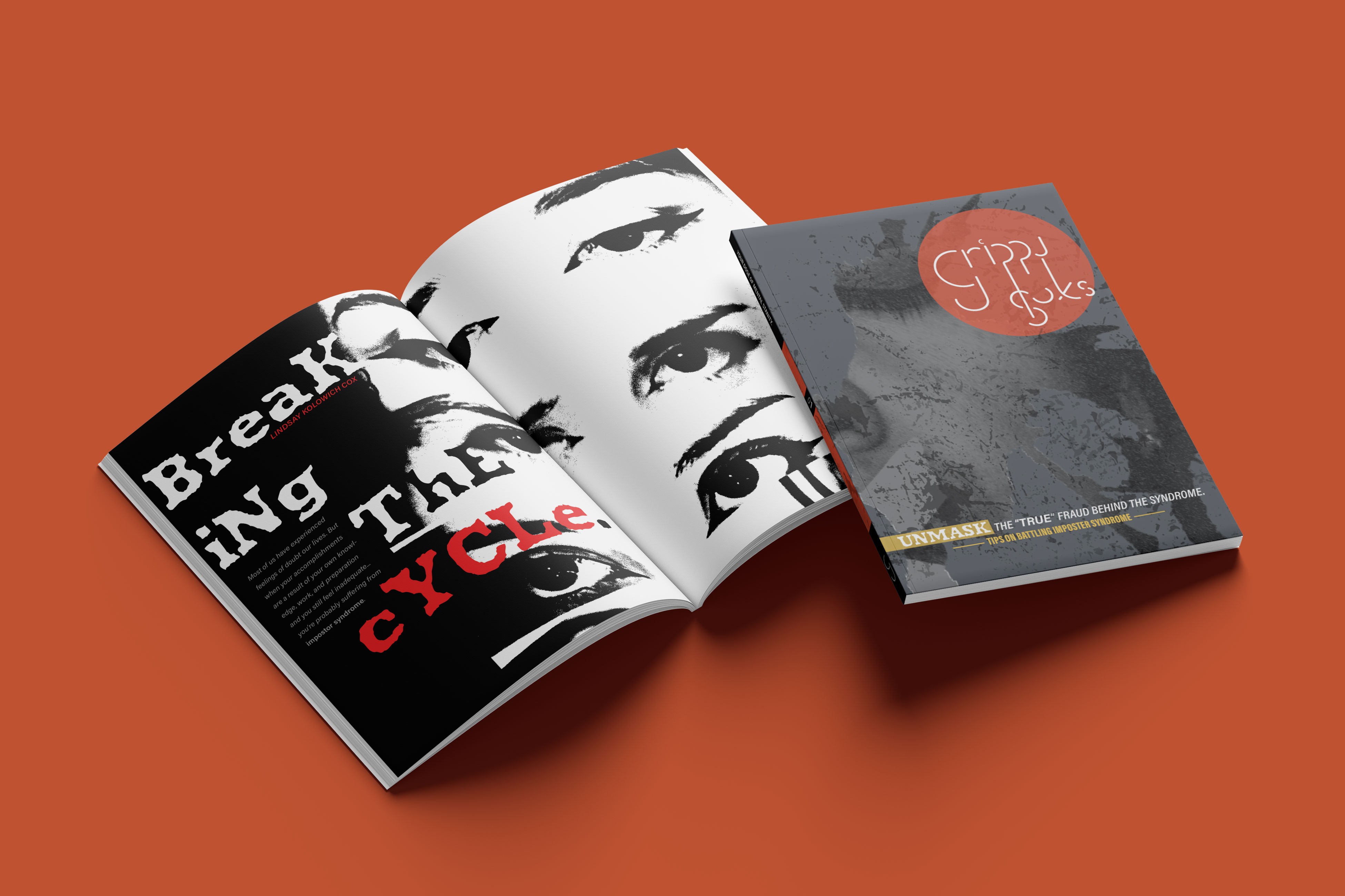
Grippy Soxs
Grippy Soxs is a magazine focusing on variety of mental health conundrums through diverse lenses and themes. Serving as ones prescribed dose of mental stability, empowering survivors, fighters, the silenced, and valued minorities.
Services
Branding
Packaging
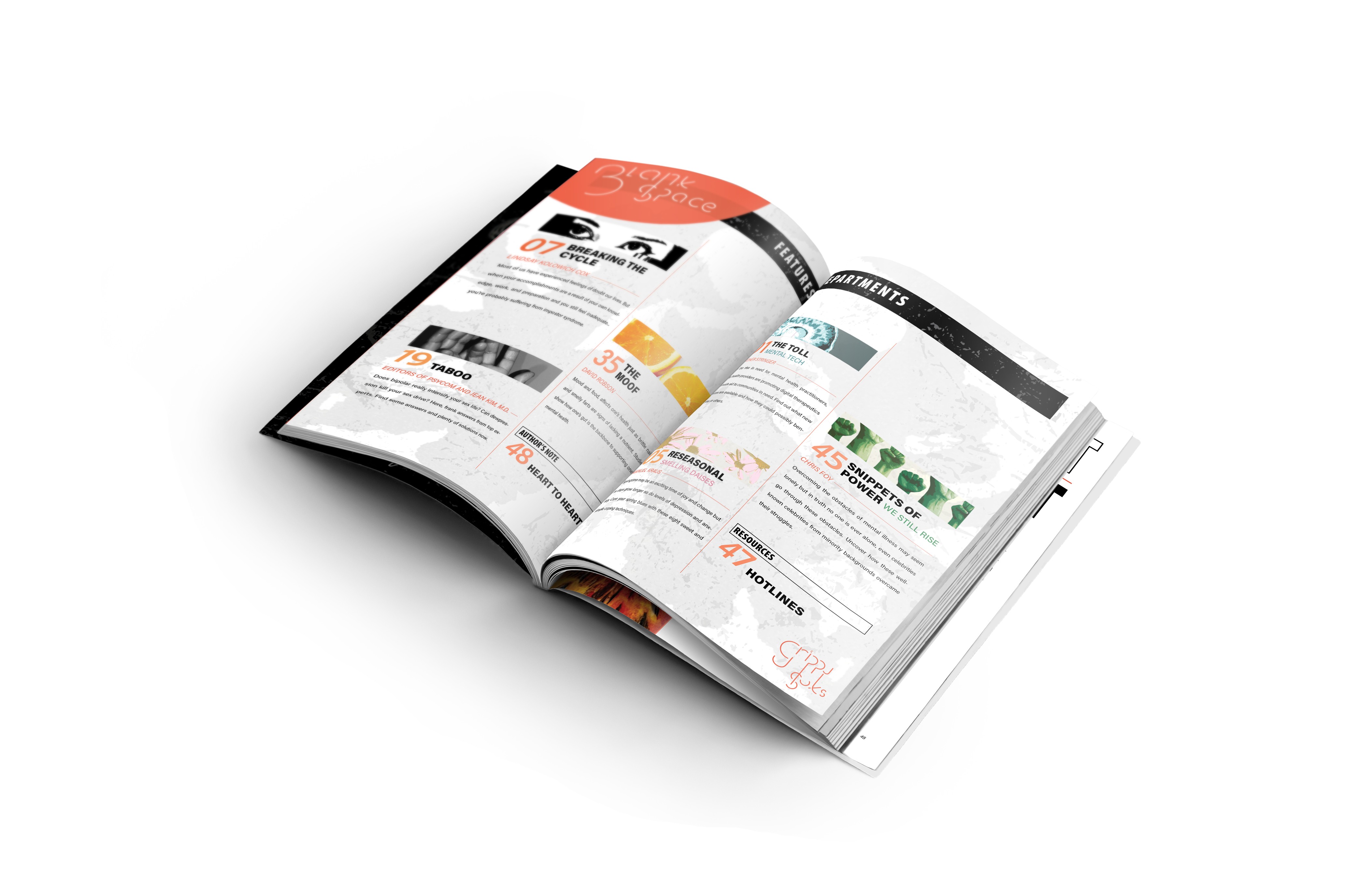
Layout
Year
2024


The magazine embraces a bold visual language rooted in contrast and metaphor. A muted orange symbolizes motivation and warmth, while black and white reflect the all-or-nothing mindset often associated with mental health struggles.


The incorporation of visually striking, abstract imagery throughout the magazine was intended to evoke emotion, spark conversation, and deepen the reader’s connection to the content.


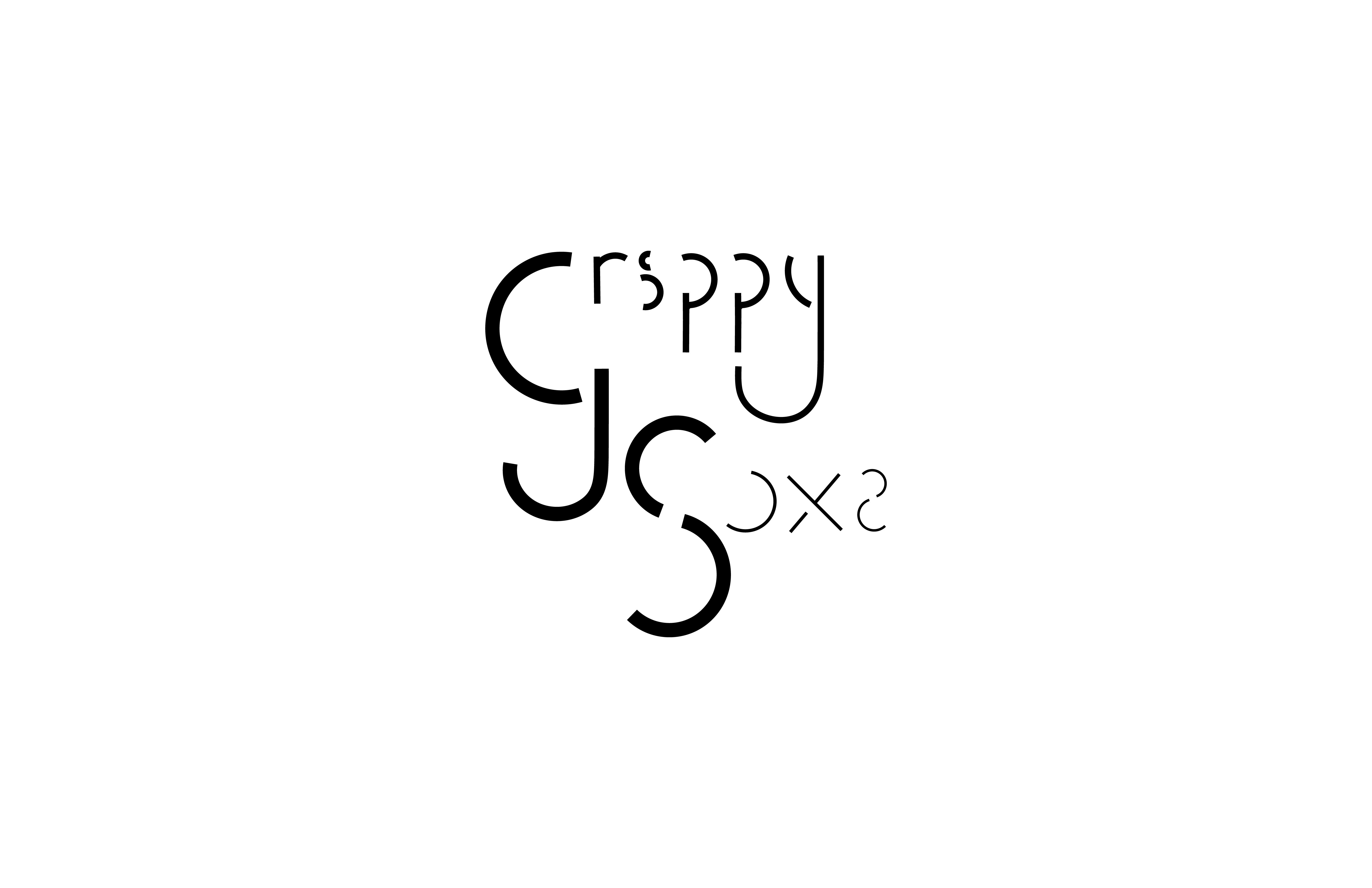
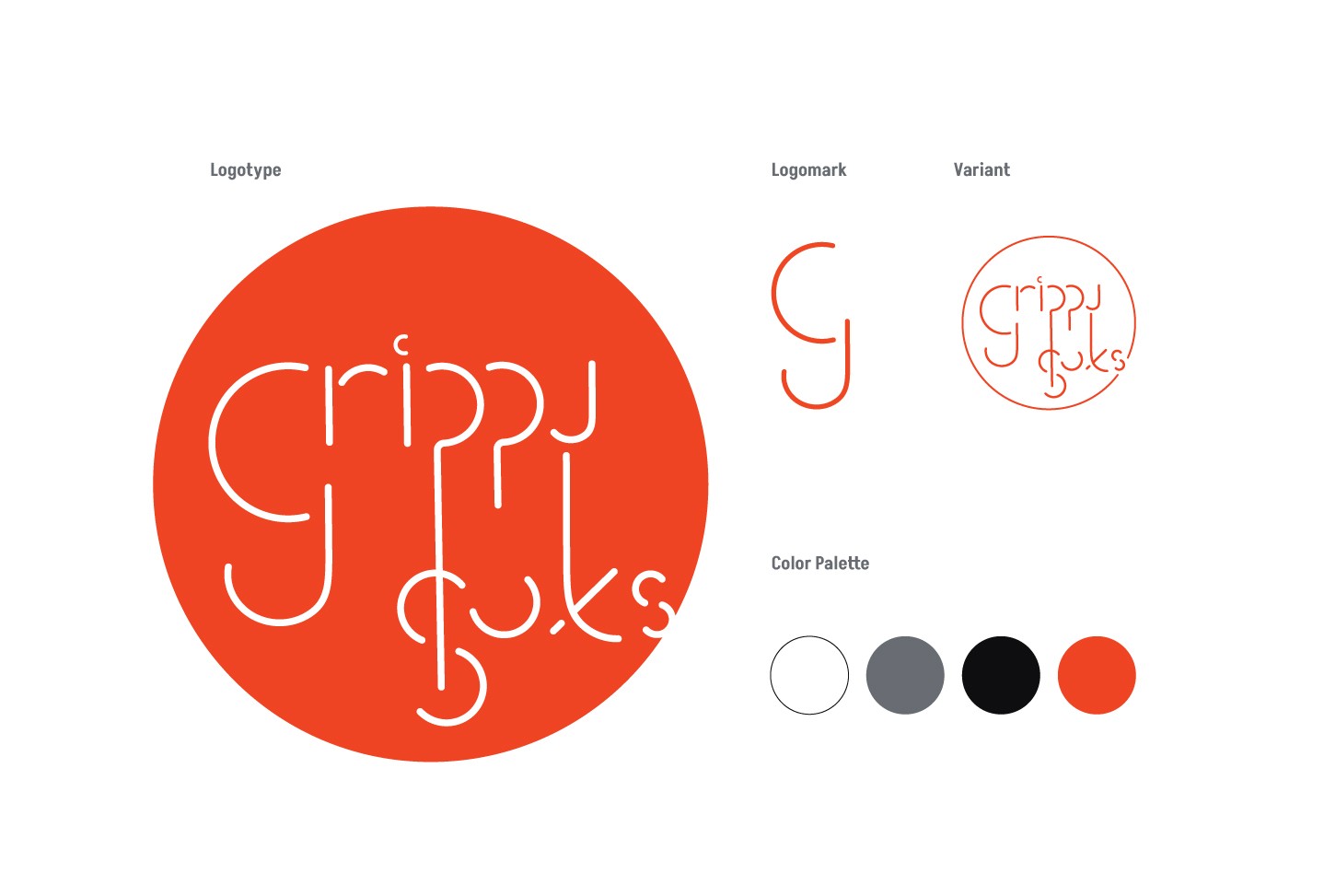
Wanting to create something bold and distinctive, I explored a variety of logo styles before landing on the final concept and developing a custom typeface. Inspired by the quirky, traction-heavy socks often given during inpatient mental health care, the magazine’s name and typeface playfully reference their pill-shaped soles. Designed to complement the overall layout, the typeface—derived from the logo—was created to further enrich and expand the branding.
